FigBuild 2026
ATTUNE,
the sixth sense
Made with ❤ by Amisha Sao & Ritsu Ueda
ATTUNE: A Sixth Sense for Conversation
Designing a real-time conversational awareness app inspired by nunchi, the Korean art of reading the room, at FigBuild 2026.
- Event
- FigBuild 2026
- Timeline
- March 2026
- Team
- Amisha Sao & Ritsu Ueda
- Focus
- Product & interaction design
The problem
Every conversation carries a second layer of meaning. Tone, pauses and energy shift long before anyone says out loud that something feels off. Picking up on that layer is a skill, and it is one most of us are never taught directly.
- People struggle to read the room.
- Conversations carry hidden emotional signals.
- Social awareness is hard to practice.
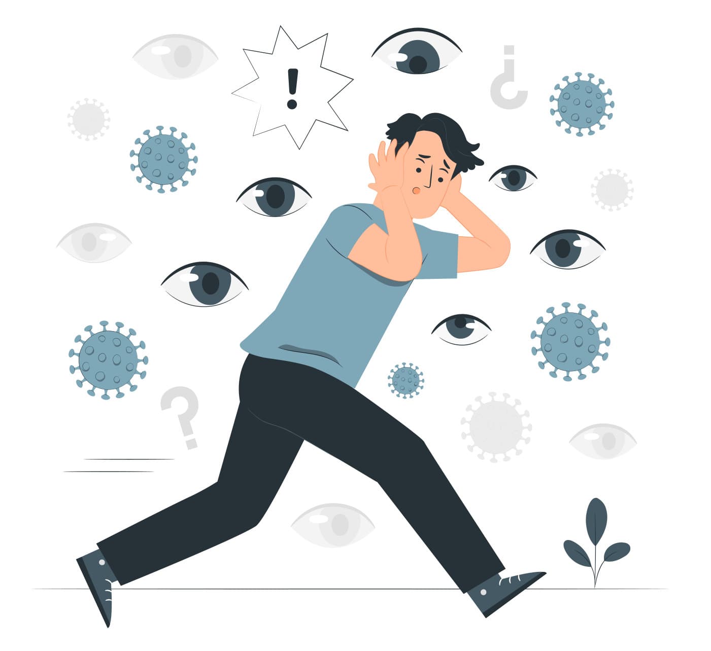
Nunchi (눈치): the Korean art of reading the room
Our starting point was nunchi, a Korean concept that translates roughly to “eye-measure.” Someone with good nunchi can walk into a room and quickly sense its mood, then adjust how they act. We built the project around three ideas from it:
01
The art of “eye-measure”
Observing what people show you, not just what they say.
02
Situational awareness over directness
Reading the context of a moment before reacting to it.
03
Processing behavior rapidly
Noticing shifts as they happen, in real time.
That led to our question: what if an app could act as a sixth sense, helping people practice nunchi during the conversations they are already having?
Introducing ATTUNE
Improve your interactions by reading the room
Concept
- 1. Start a conversation activity
- 2. See a live emotional heatmap
- 3. Receive real-time insights
Wellness goals
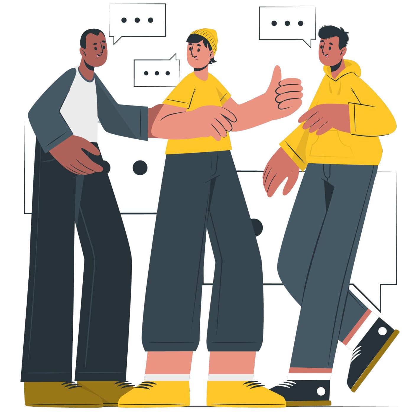
ATTUNE is meant to help bridge the gap between social perception and internal peace. We framed the product around three kinds of wellbeing:
Social wellbeing
Users can move through social interactions more smoothly, which lowers social anxiety.
Mental wellbeing
Users get real-time feedback on how the conversation is going, along with validation when it goes well.
Emotional intelligence
Over time, users build the skill of recognizing how others are feeling on their own.
Prototyping
Low fidelity
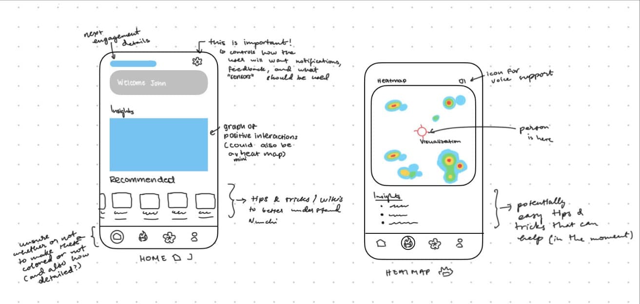
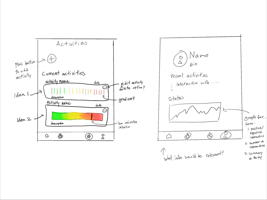
We started on paper, sketching the four tabs of the app and annotating every open question as we went.
Home
Details for your next engagement up top, a graph of positive interactions (possibly a mini heatmap), and recommended tips and wikis to help you better understand nunchi. We flagged the settings icon as important: it controls how users want notifications and feedback, and which “sensors” ATTUNE should use.
Heatmap
The first heatmap was a free-form visualization with a marker showing where you are relative to everyone else. An icon in the corner controls voice support, and below the map sit quick insights: easy tips and tricks that help in the moment.
Activities
A plus button to add an activity and a list of current ones. We sketched two ideas for summarizing each activity: a series of colored lines, or a smooth calm-to-tense gradient with a bar marking the intention you set.
Profile
Name, bio, recent activities, and a status graph. The big question here was what information would actually be relevant: positive and negative interactions, the number of interactions, or a summary of the day.
Mid fidelity
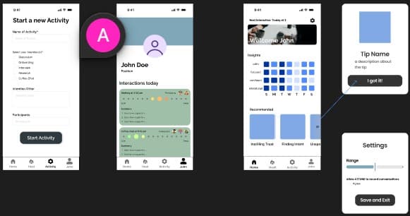
In Figma, the sketches became a connected flow. Before a conversation, you start a new activity: name it, choose an intention (like a discussion, an interview or a coffee chat), and add participants. The home screen greets you with your next interaction, a week of insights, and recommended tips like “Instilling Trust” and “Finding Intent.” Settings let you choose whether ATTUNE is allowed to record conversations at all.
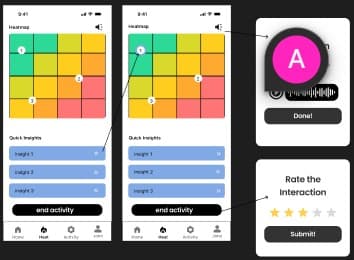
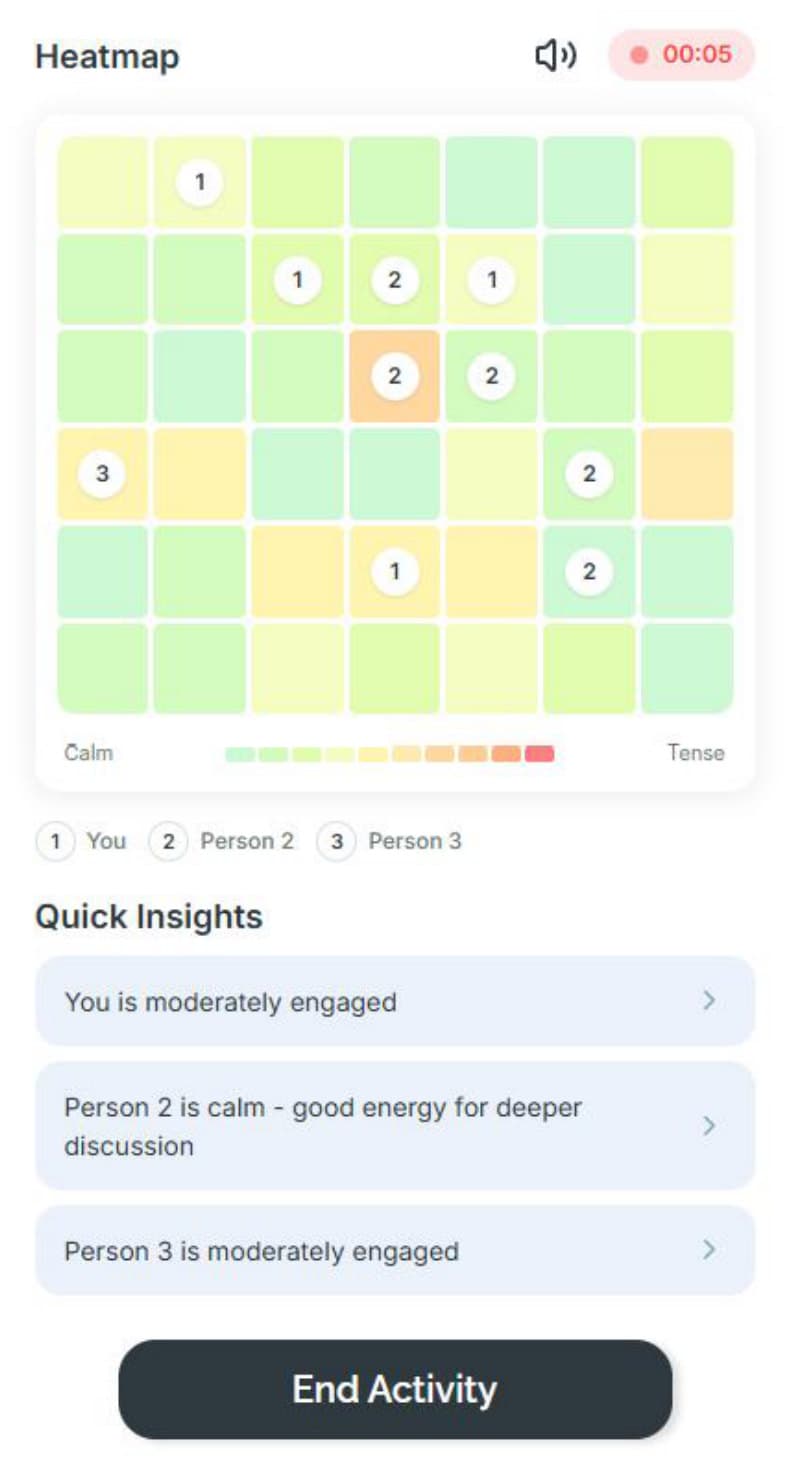
During an activity, the heatmap turned into a grid that moves from green to red, with numbered markers for each participant and quick insights underneath. Tapping the speaker icon opens voice recording, and ending the activity asks you to rate the interaction, closing the loop between what ATTUNE sensed and how the conversation felt to you.
Style guide
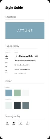
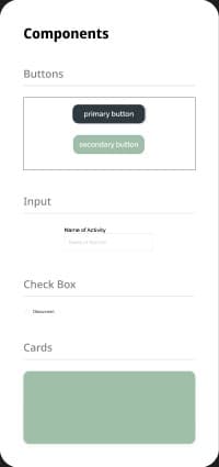
To move into high fidelity, we pulled the visual language into a small style guide: the ATTUNE logotype on our signature blue, Raleway for headings and Inter for everything else, a calm primary palette of blue, sage and off-white, and a heatmap scale that runs from mint to coral. Charcoal primary buttons and sage cards and secondary buttons keep the interface quiet, so the heatmap can be the loudest thing on screen.

High Fidelity
Key feature: the heatmap
The heatmap is the core of the experience. During an activity, each person in the conversation appears as a numbered marker on a grid that shifts from calm greens to tense oranges and reds. A recording indicator and timer stay visible at the top, so you always know the session is live.
While in a conversation, you can:
- Detect calm and tense moments as they happen
- Gain key insights to have more intentional conversations
- Be mindful of how your words affect others
Under the map, a Quick Insights panel turns the colors into short, readable notes for each person, like “Person 2 is calm — good energy for deeper discussion.” When the conversation wraps up, End Activity closes the session.
Try the prototype
The high fidelity prototype was built in Figma Make. Tap through it below, or open it in a new tab.
Safeguards & privacy
An app that listens to conversations has to earn trust. We treated privacy as part of the design from the start:
- Opt-in recording. Voice recording sits behind a clear toggle.
- Active sessions only. Recording runs only while an activity is running.
- State, not content. The heatmap gives no information about conversations outside an activity, and it only tracks whether people seem calm or tense, not what was said.

Attune
Your 6th sense for conversation