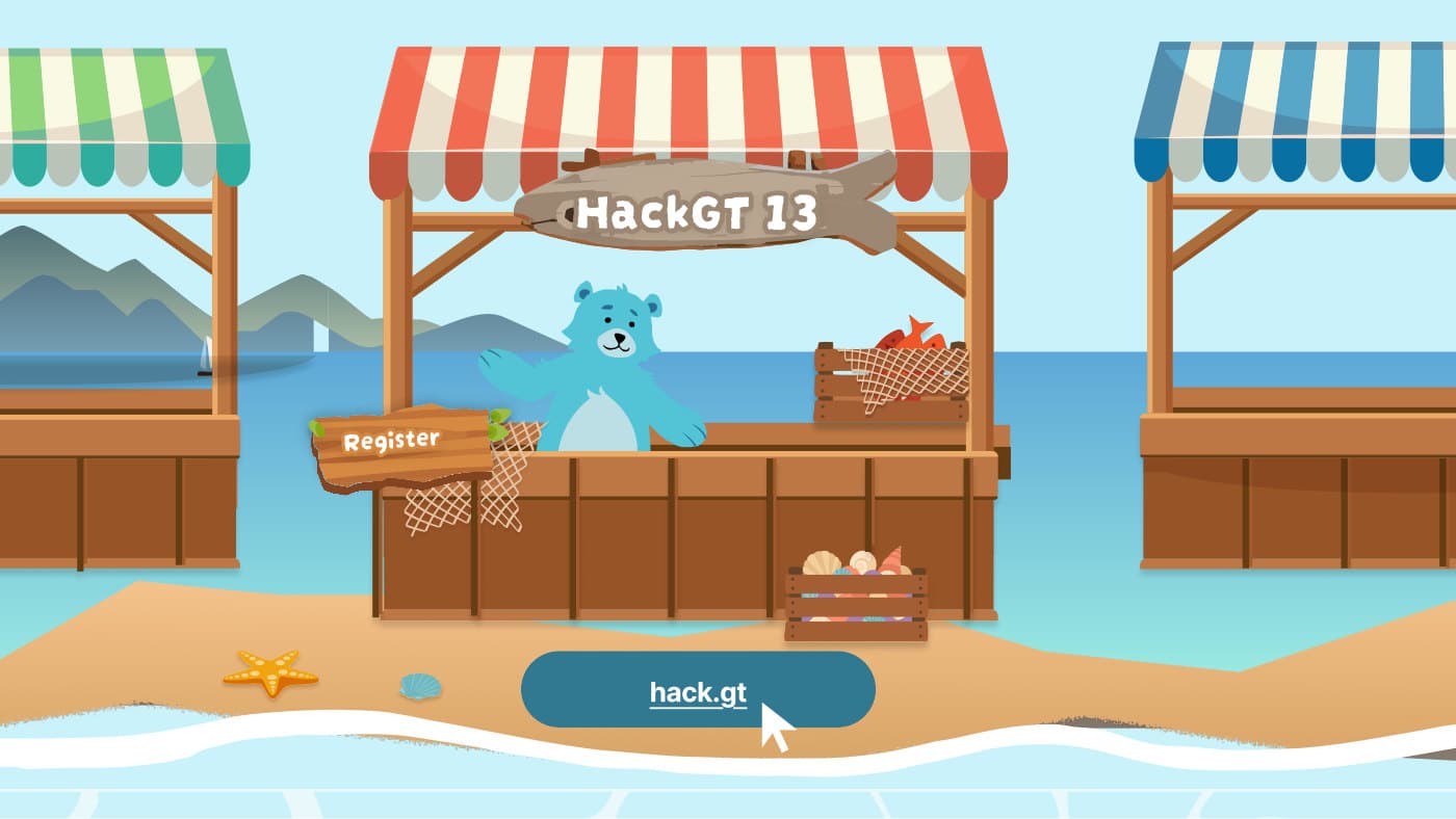
HackGT 13: Designing a Seaside Market Website
Taking the HackGT 13 website from information architecture to a high-fidelity seaside market design, and then into code.
- Role
- Design Engineering Director
- Organization
- HexLabs
- Timeline
- 2026
- Tools
- Figma, React, TypeScript
About HexLabs
Each year, HackGT welcomes 1,500+ hackers from around the world to tackle novel challenges, win prizes and make lasting connections. HackGT's stage is open to everyone, regardless of background, experience or skill level. Hackers can expect a weekend full of networking, top-tier prizes, mini-events and lots of swag.
This year, I worked as a design engineering director, designing the website and leading the software engineers who built it. The site went on to attract thousands of applicants.
How should the website be organized?
Before drawing anything, we agreed on the job each section of the site had to do.
About
Explain who HexLabs is, and why people should apply to HackGT 13.
Tracks
A HexLabs tradition: showcase the event-specific tracks with imaginative, engaging art, while keeping each track clearly understandable.
Schedule
An interactive section that gives participants a glimpse of the weekend's events.
FAQ
Clearly answer commonly asked questions. The toggles should be on-theme but still easy to understand.
Prototyping
Interaction flow
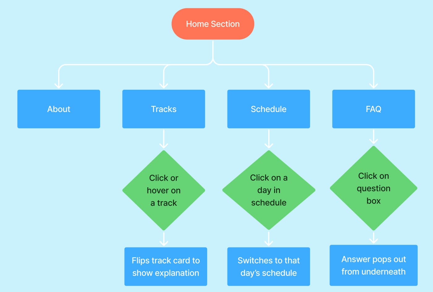
Each section had a single key interaction, which I mapped out so the team knew exactly how it should behave:
- Tracks: click or hover on a track to flip the card and reveal its explanation.
- Schedule: click a day to switch to that day's schedule.
- FAQ: click a question box and the answer pops out from underneath.
Low fidelity
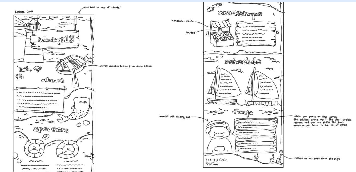
A teammate sketched the first low fidelity pass, laying out the seaside market world: a lighthouse hero, boats, market stalls for workshops and a sailboat schedule.
Mid fidelity
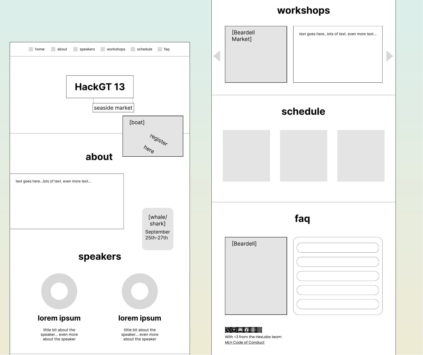
Building on my teammate's sketches, I put together a quick mid fidelity version and wireframed the important sections: home, about, speakers, workshops, schedule and FAQ.
Keeping the illustrations as labeled placeholders, like [boat] or [whale/shark], let us lock down the layout and content before spending time on art.
Iteration 1 & Design Decisions
Current problems
Once the first full design came together, two problems stood out.
Section transitions
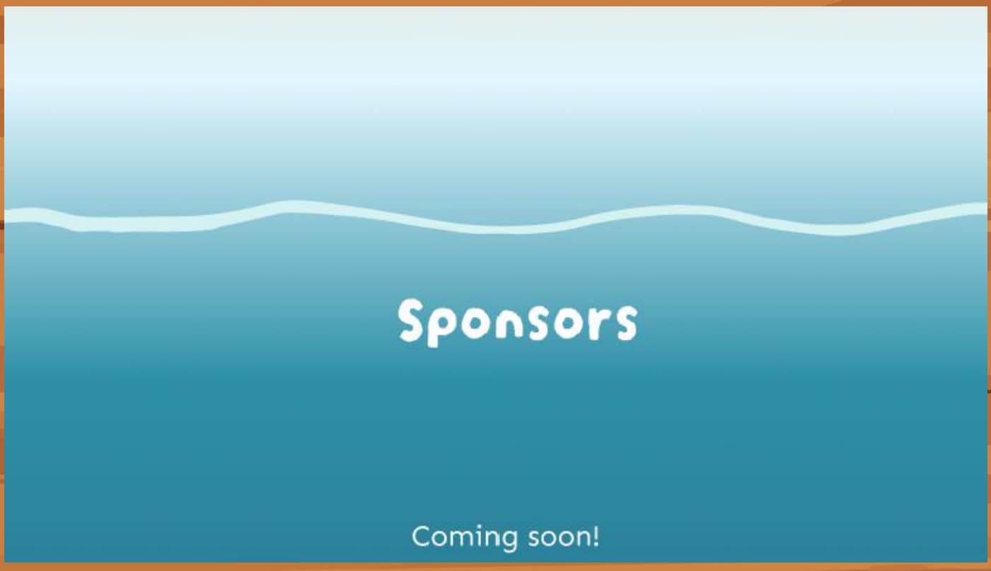
There was a transition between each section, but some of them felt rough. And the more sketch-like a transition was, the harder it was to implement perfectly in code.
Themed illustrations
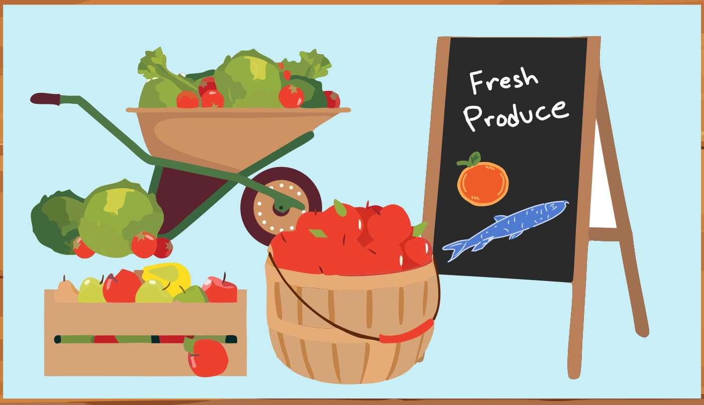
Many illustrations were about groceries and fresh produce in general rather than a seaside market. They felt out of place next to fish and other things you'd actually expect at a seaside market.
Final High-Fidelity Design
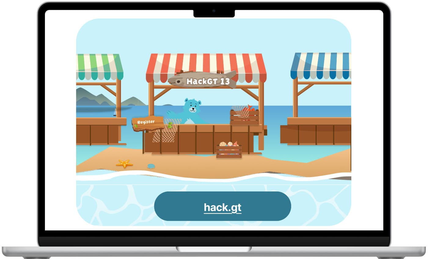
The final design brings the seaside market concept together from hero to footer. I then helped bring it to life as a fully responsive React and TypeScript website, so the experience holds up on every screen size during a high-traffic event.