Inner Hues: Making Art a Judgment-Free Form of Self-Care
A user research and prototyping case study from the Bits of Good Design Bootcamp, exploring how to lower the barriers that stop people from making art.
- Program
- Bits of Good Design Bootcamp
- Timeline
- Jan 2026 - Apr 2026
- Team
- Amisha Sao & Ritsu Ueda
- Methods
- Surveys, interviews, usability testing
Motivation for our research
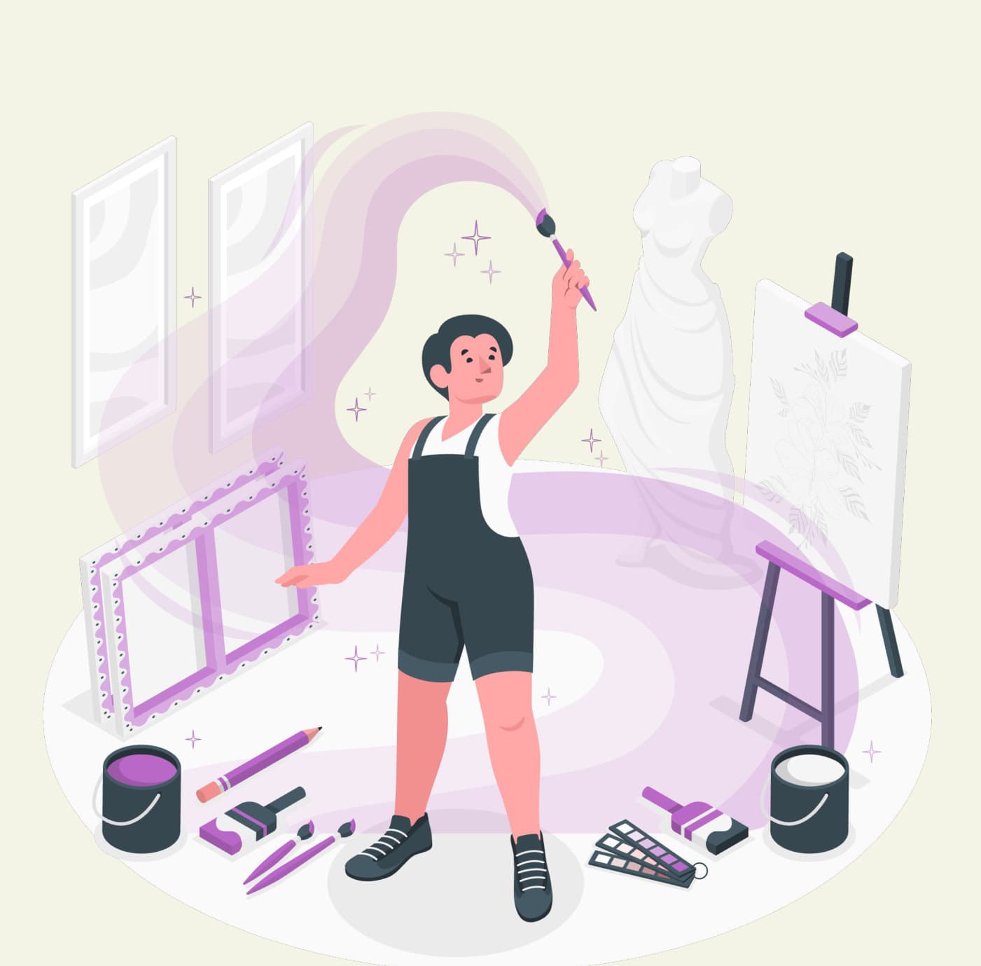
Art is an act of mindfulness and can allow people to be more present.

People of varying skill levels can find joy in making art.
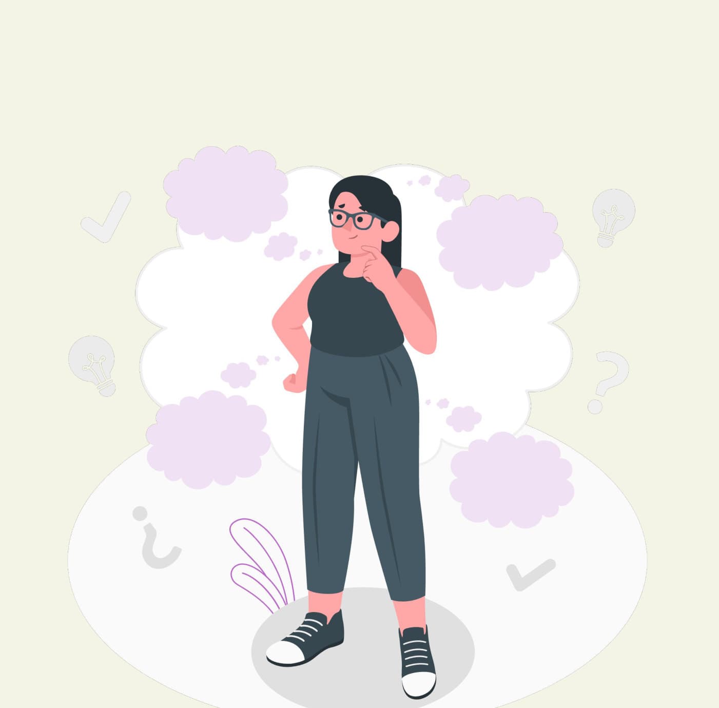
Perfectionism can be a creative block.
Making art is good for you, but plenty of people never start or give up early. We wanted to understand what gets in the way, and how a product could make the process feel lighter.
User Research
Research question
How might we make art a stress-free form of self-care, free from the pressure of perfection?
Research goals
- Identify positive and negative experiences people have with art.
- Understand what specifically prevents people from starting a new artwork.
- Explore ways to lower barriers to the art-making process.
Competitor analysis
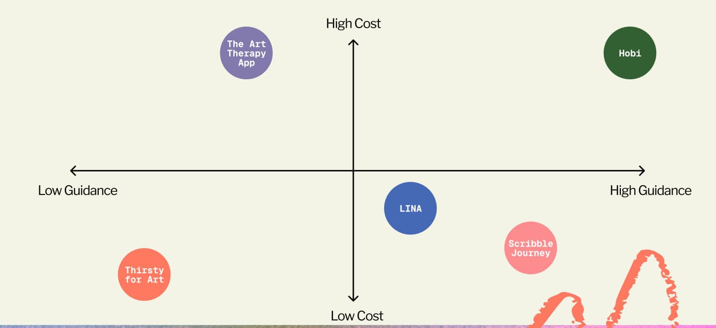
We mapped five existing apps by cost and by how much guidance they give: The Art Therapy App, Hobi, LINA, Scribble Journey and Thirsty for Art. Seeing them on two axes made it easier to talk about where a new tool could fit.
Research method & participants
Surveys
We shared the survey with roughly 300 students through creative and community organizations, including The Hive Makerspace and The Artsy Orchard Instagram. We received 15 valid responses.
In-depth interviews
We recruited four interviewees from the survey respondents:
- P1: Content editor who enjoys art but isn't an artist
- P2: Art hobbyist who works in many mediums and took AP Art Portfolio
- P3: Hive crafts master PI who crafts for fun
- P4: Artist who takes commissions
Key findings
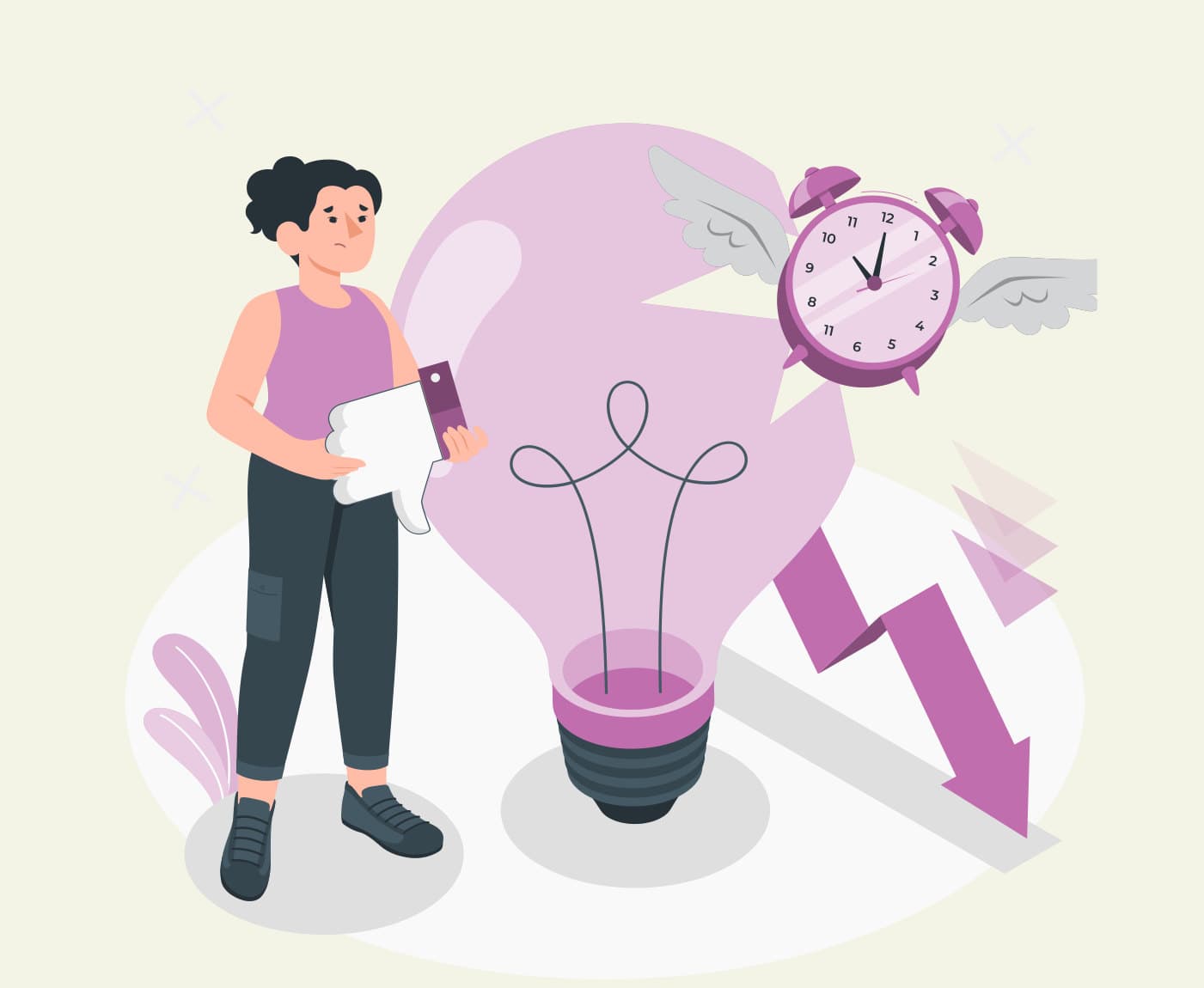
Lack of time & confidence
These were the top two barriers across both the survey and the interviews.
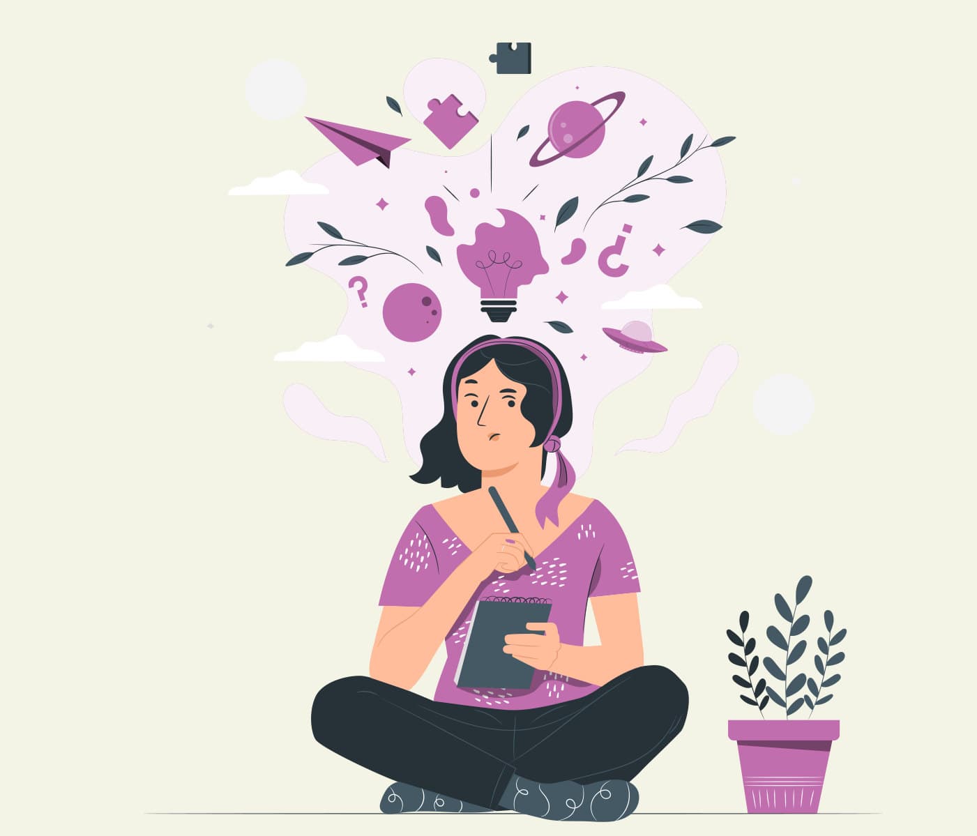
Too many options are overwhelming
Having too many ideas, or none at all, is stressful and blocks creativity.
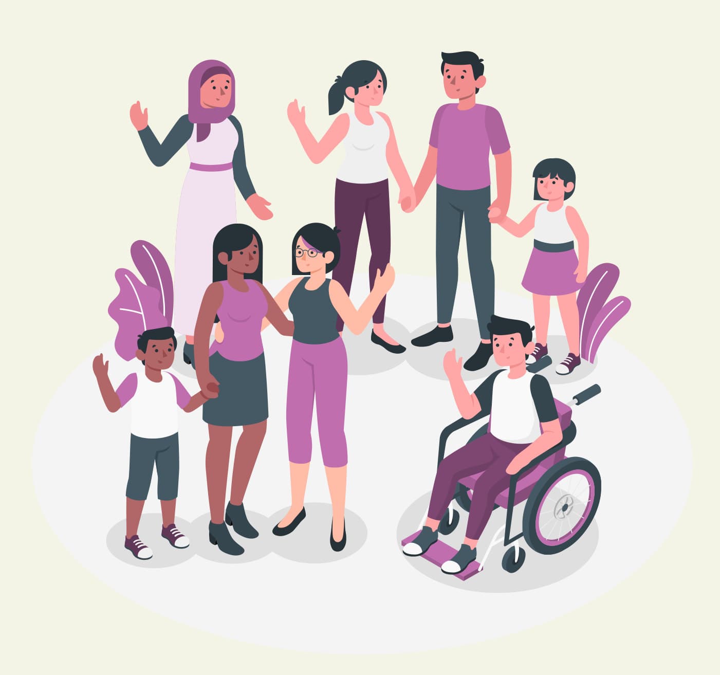
Supportive community without critiques
Interviewees said art should be a judgment-free activity that values the process over the product.
Design recommendations
Each finding turned into a “how might we” question:
- How might we lower barriers for both artists and non-artists facing time constraints and low confidence?
- How might we simplify the art-making process to prevent choice paralysis?
- How might we design a judgment-free community that prioritizes process over product?
Prototyping
User flow
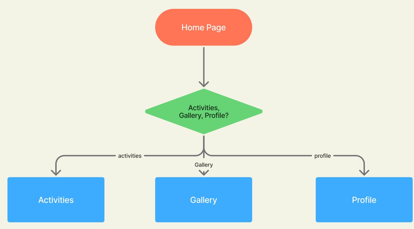
We kept the structure simple: from the home page, users branch into three areas: Activities, Gallery and Profile.
Low fidelity
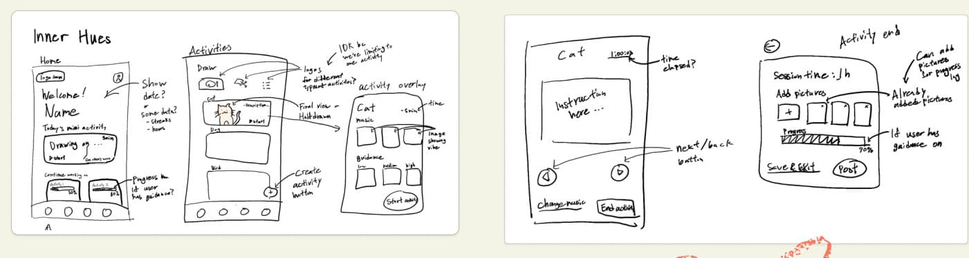
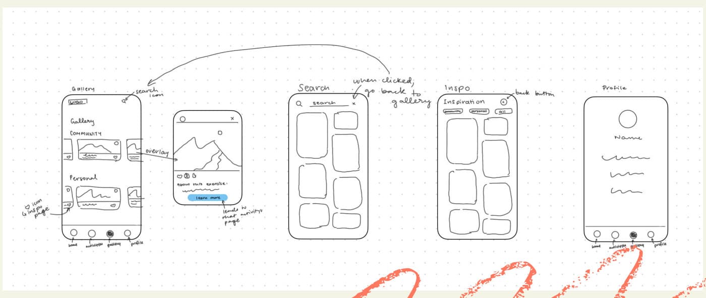
We sketched quickly on paper and whiteboard to explore layouts for each screen before committing to anything in Figma.
Mid fidelity wireframes
Home
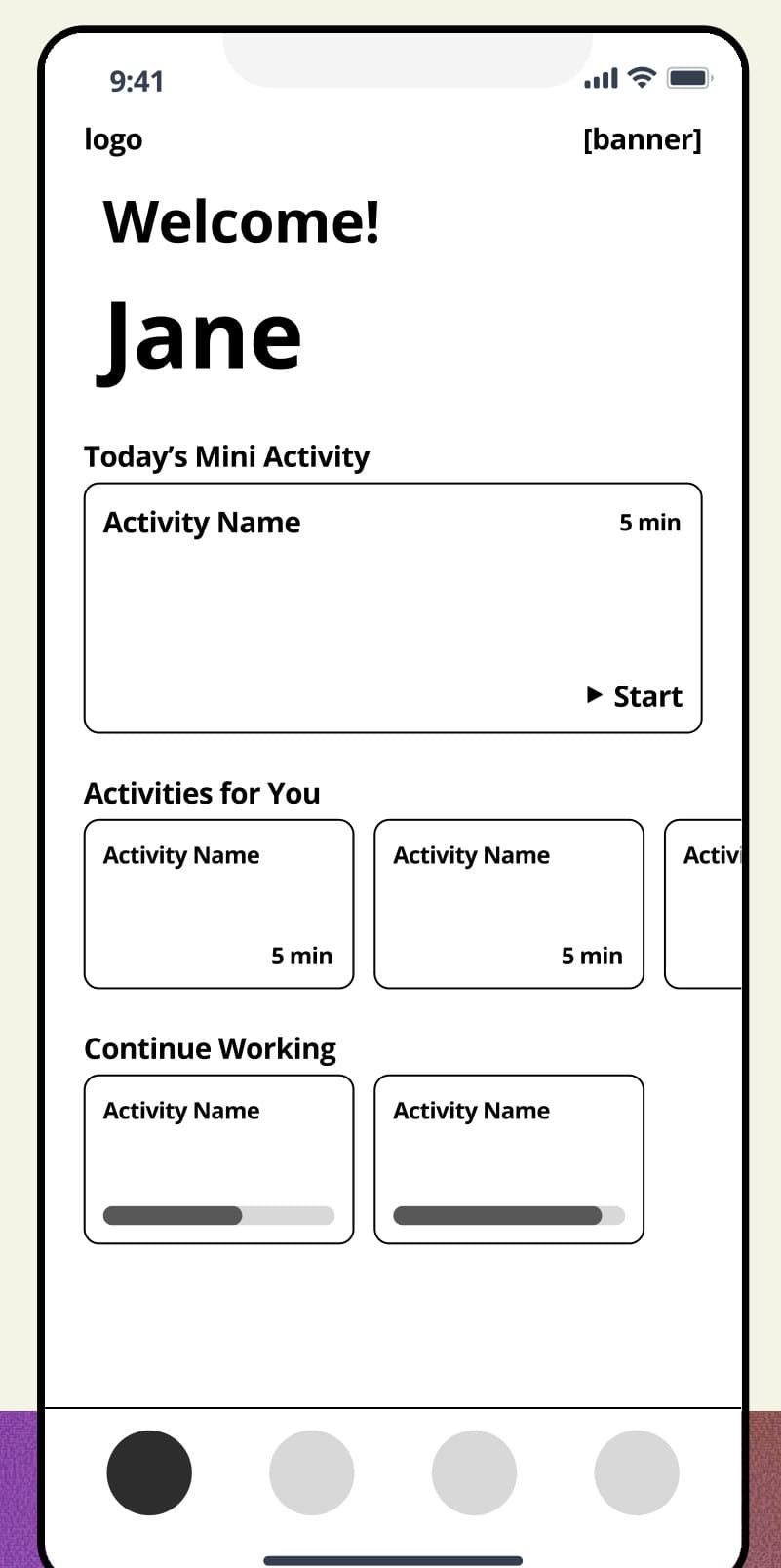
A daily mini activity with its time estimate shown up front. This lowers the barrier to starting by addressing time constraints, and builds confidence along the way.
Activity
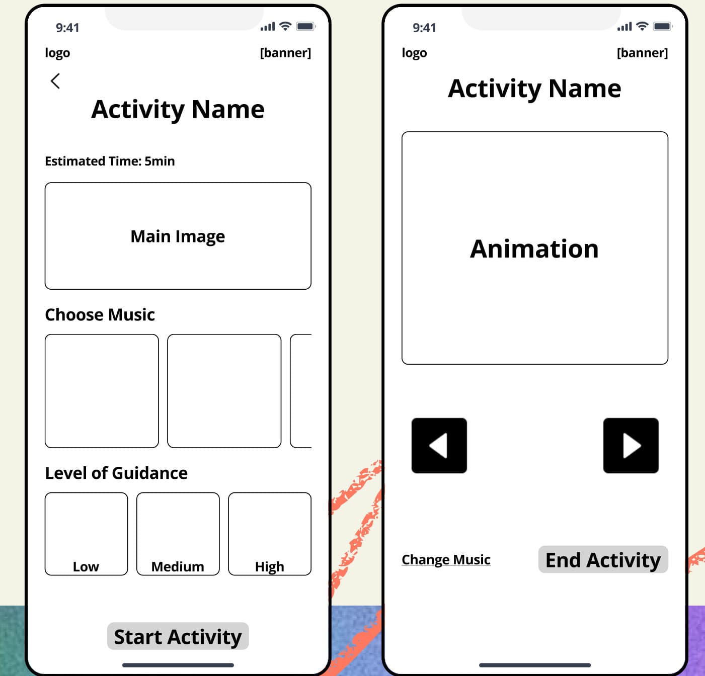
Step-by-step instructions with adjustable levels of guidance make each activity feel approachable, reduce decision fatigue, and build confidence for every skill level.
Gallery
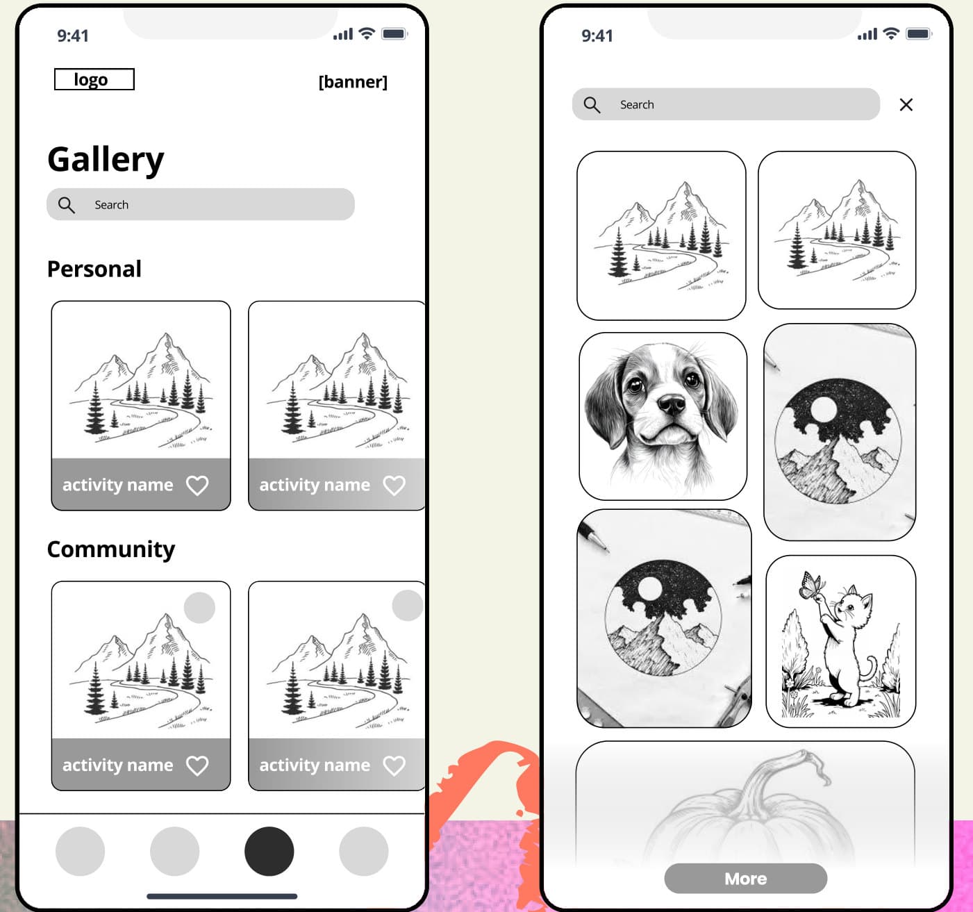
A shared space where users can explore others' work and share their own, building a supportive community centered on participation and creativity rather than judgment.
Feedback & Iterations
We ran usability tests on the mid fidelity prototype. Three themes came up again and again, and each one shaped the final design.
Improved navigation
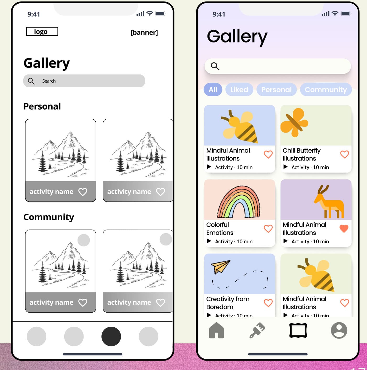
Users found the side scrolling unintuitive, categories were difficult to filter, and the outlined cards felt sharp and tense.
For the final design, we:
- Changed horizontal scrolling to vertical
- Added tabs for each category instead of relying on subheadings
- Set cards apart with shadow and color instead of outlines
BeforeAfter
Clarifying levels of guidance
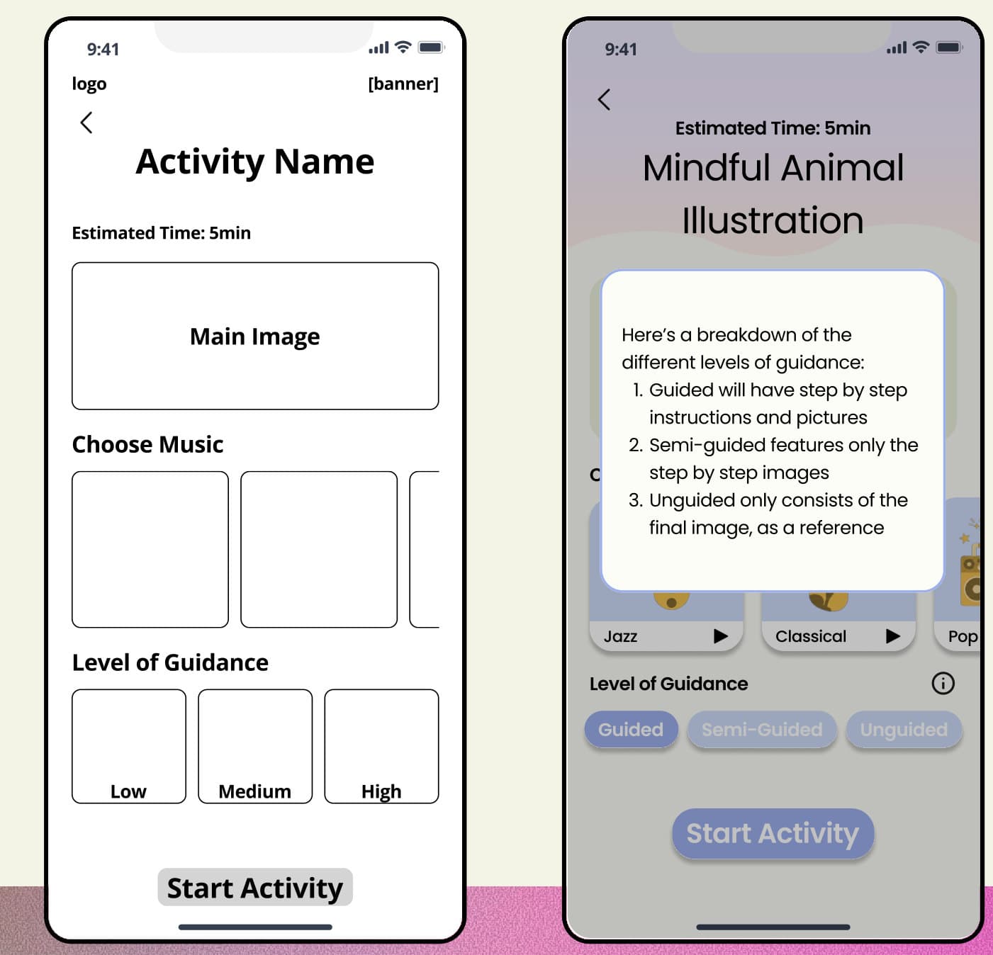
Users didn't understand what low, medium or high guidance meant, and the section didn't look like a button.
For the final design, we:
- Added an info icon that explains each level of guidance when tapped: Guided, Semi-Guided and Unguided
- Used consistent buttons that clearly highlight the current selection
BeforeAfter
Improved visual clarity
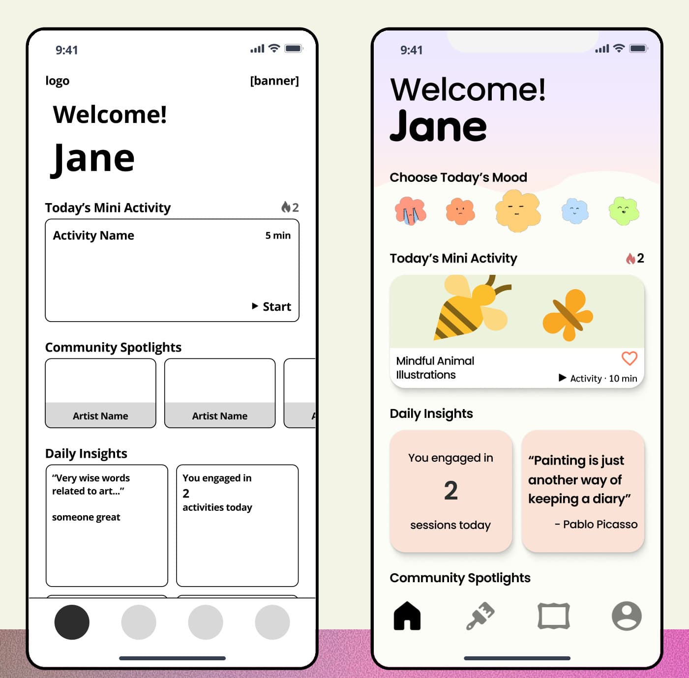
The initial design was visually cluttered. The sharp edges and small text didn't match the calm aesthetic we were going for.
For the final design, we:
- Increased the corner radius
- Refined the text hierarchy
- Applied a pastel color palette
BeforeAfter
The final prototype
The final design brings everything together: a short daily activity on the home screen, guidance you can dial up or down, and a gallery that feels like a community rather than a critique. We presented it as a live demo at the end of the bootcamp. Tap through it below, or open it in Figma.
Key takeaways
- Visual clarity is about intent, not just aesthetics. Every design choice should tell the user how to feel and what to do next.
- Creativity thrives in safe, judgment-free spaces. Beginner or seasoned artist, everyone needs a space where they feel valued.
- Art therapy is a growing field. Design has a real opportunity to shape how it develops and to keep it accessible to everyone.